Higher & Further Education
Portland Building, University of Nottingham
Services
Architectural Design
Interior Design
BIM (Building Information Modelling)
Project Overview
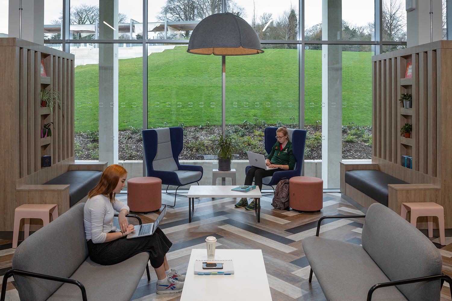
Re-orientating the University of Nottingham’s Portland Building to address the new heart of the campus was not without its challenges. It was necessary to remain sensitive to both the heritage of the original, Neo-Classical, 1950s building and Michael Hopkins’s 2003 extension. The solutions, developed in conjunction with successive Students’ Union representatives’ year-on-year, are bold, yet sensitive to achieve their aspirations. This was an iterative process of collaborative design and post-occupancy evaluation, resulting in a dynamic and attractive student hub.
However, the findings of extensive market research and Students’ Union peer surveys, showed that Portland was considered as largely ‘functional’. There was little emotional connection with the building and its many facilities that support student life. Instead, the discerning student population chose to migrate to the city to access facilities and enjoy spaces that better reflected their aspirations. Research uncovered the following problems:
- lack of identity- the building served multiple purposes for a range of stakeholders
- too busy - due to mixed-use and timetabled teaching
- too many corridors - creating a warren of spaces which encouraged silo behaviour
- lack of space - wide-ranging uses meant that space for dedicated activity was both at a premium and compromised
- inaccessibility and invisibility of services - as a result of the age of the building and the layout
To fulfil its potential, it was necessary to redefine Portland in number of fundamental ways:
- by reinventing the building as a destination that opens horizons through new experiences
- by fostering greater connections with the parkland setting
- by creating a desirable venue in which to socialise, learn and relax
- by tailoring spaces to promote unplanned encounters and spontaneous collaborations
- by establishing a new and unique Portland identity reflecting student values

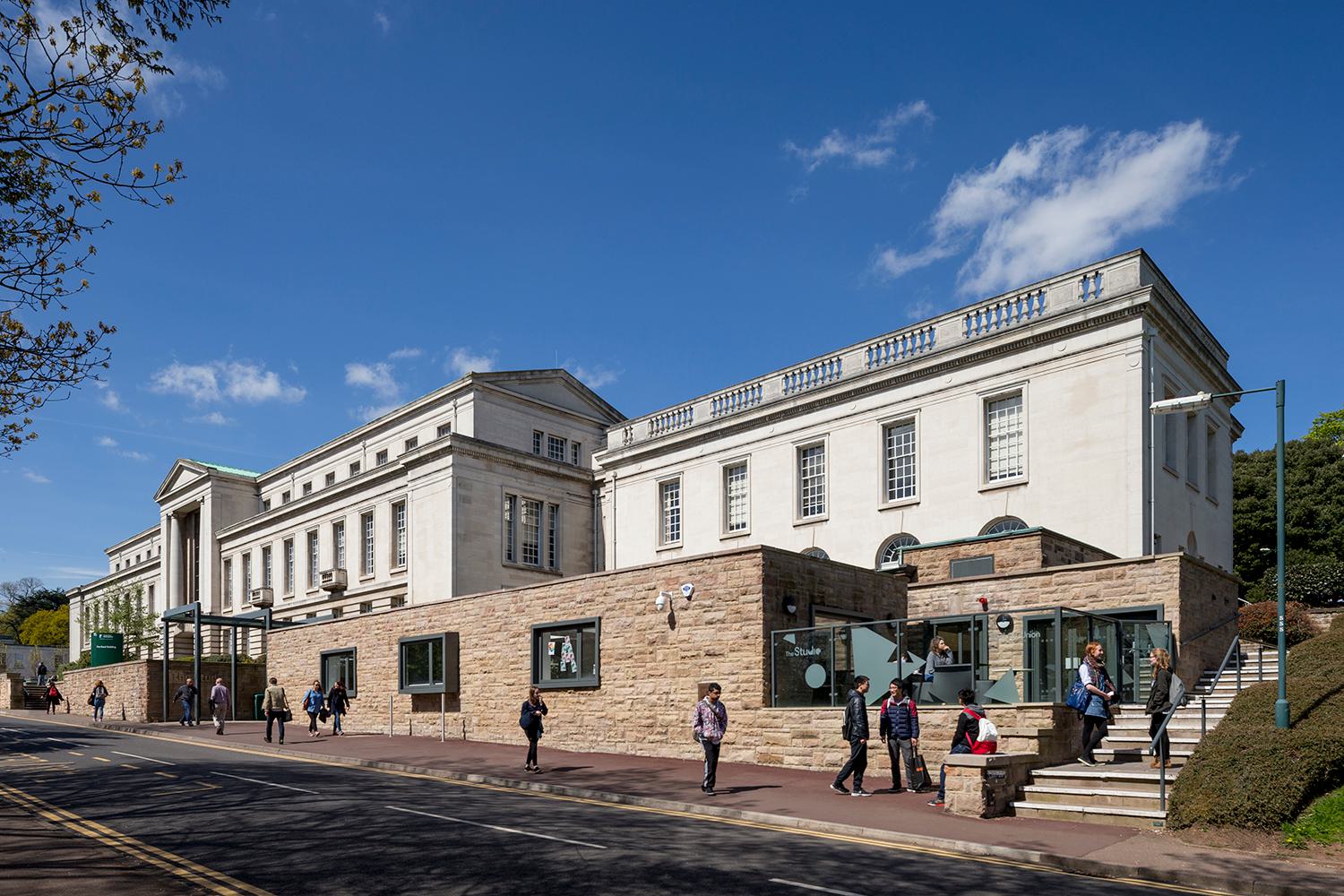
Portland Building was originally constructed in the 1950s, in the neo-classical style, remodelled and refurbished in the early 1990s and extended to the rear in 2003, by Michael Hopkins. Over this time, the university and its campus have developed and grown to the extent that the principle flow into the building is no longer via the main entrance of the 1950s building with its neo-classical portico, glazed, timber-lined stair rising four storeys with its commanding views over the lake and University Boulevard beyond. Instead, the gravitational pull is the extension’s entrance from Portland Hill to the rear.
Re-orientating the Portland Building to the new heart of the campus and the evolving the needs of its population was not without its challenges. It was necessary to remain sensitive to both the heritage of the original building and its remaining features and Michael Hopkins’s 2003 extension, and all while maintaining the existing services and environmental strategies.
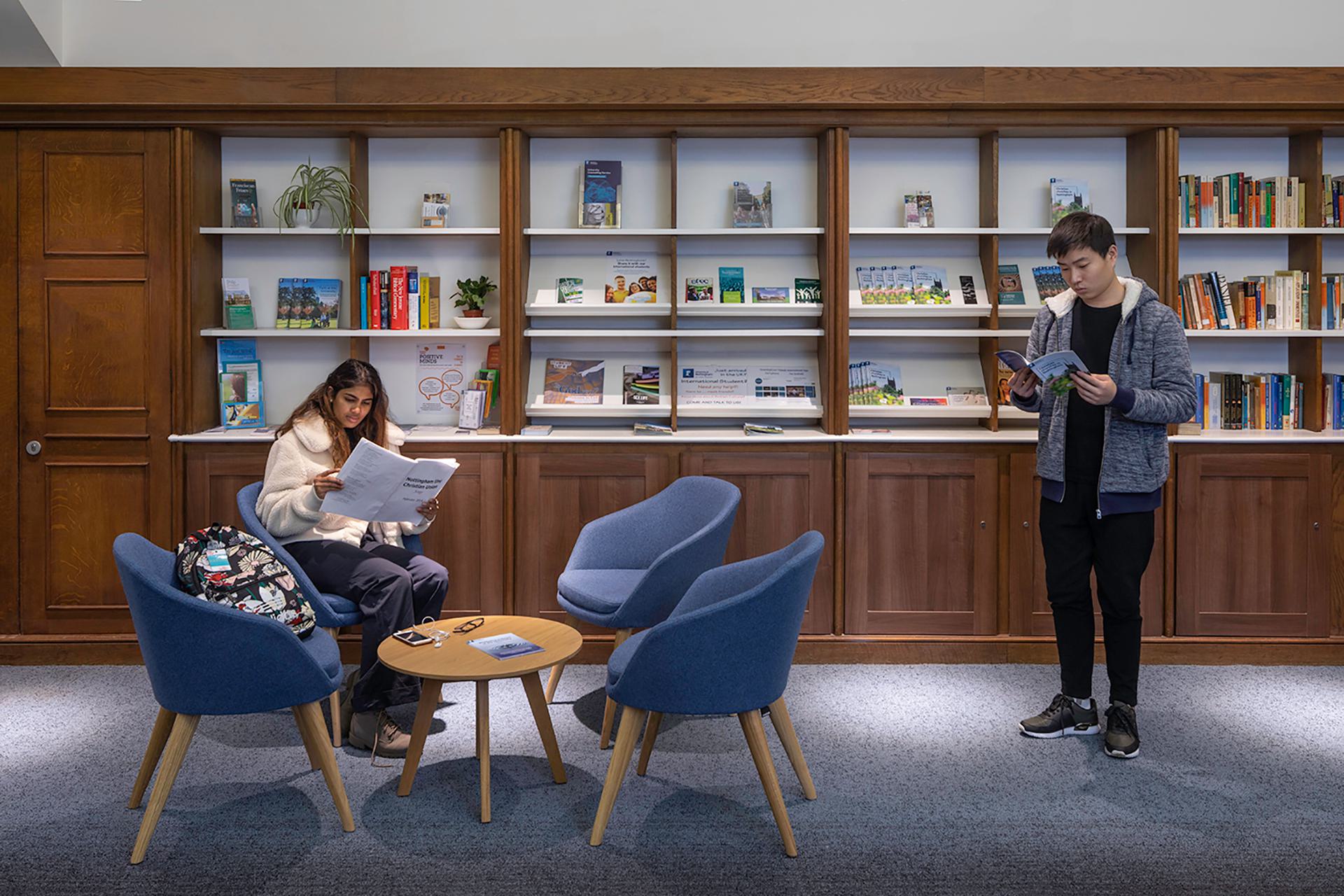
That the building suffers from a lack of internal connectivity and transparency is a clear message from the research and is highlighted further by the aspirations of the Students’ Union to break down barriers between activities and spaces. Effectively responding to this desire was key to unlocking the potential of the building: to create a more vibrant and inspiring environment in which to learn and socialise, and where blurred boundaries between activities reflect the flexible, inter-connected, technology-based world which the occupants inhabit. Simplifying Portland’s organisation and the wider relationship of spaces, enhances its sense of welcome, its user-friendliness and its wayfinding, legibility and accessibility.
The solution developed in conjunction with the Estates Office and successive Students’ Union representatives, year-on-year, is bold, yet sensitive to achieve their challenging aspirations for transformation within strict cost constraints and tight timescales. This was an iterative process of collaborative design and post-occupancy evaluation resulting in a dynamic and attractive student hub, equipped to respond to the evolving demands of its students.
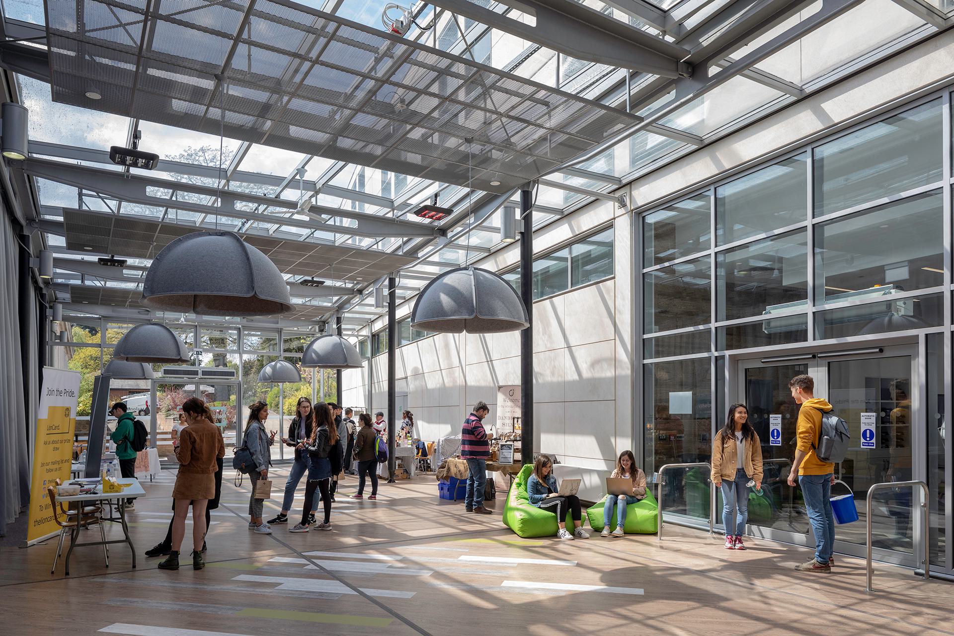
Phase I saw the creation of a bold new performance venue and flexible space supporting the many and varied activities associated with society membership. Formally an underutilised, dark and unattractive corner of Portland Building, the former performance venue turned its back on its student population and the fabulous views of its parkland setting.
This new, highly flexible hub revitalises the east wing, reconnecting it with the landscape and creating a new, impressive entrance with identity. A key element of the overall masterplan, this critical phase of the development unlocks this remote part of the 1950s building, creating a highly visible, accessible and dynamic hub of student life.
The Students’ Union are now able to have their full ‘Welcome Week Fair’ in the building, companies are very keen to be involved and take the opportunity to introduce their company to the students.
The best and most defining comment received from the Students’ Union has definitely been ‘…the building is unrecognisable from before, I cannot even remember what it looked like!’
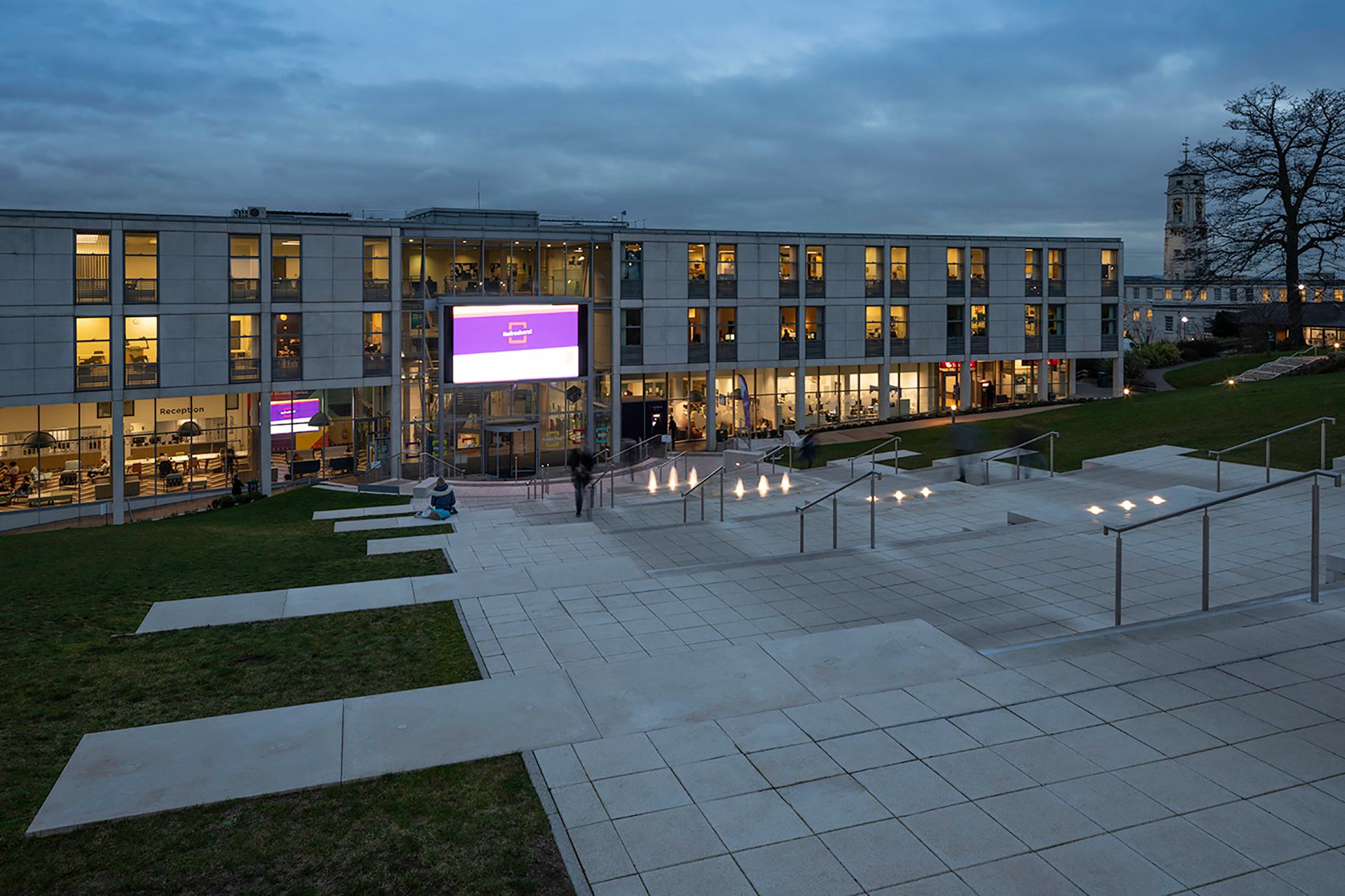
Phase II focused largely on creating greater connection with the University’s parkland setting, responding directly to a key aspiration of the student’s union. An existing terrace is extended, creating greater social and performance space for use throughout the year. Having established a faith zone anchored around the original chapel, a peace garden is created by extending a narrow fire escape route into a quiet contemplation space with fixed seating and integrated sensory planting. At the very top of the building, the existing food court engages with its balcony terrace to create a seating area with commanding views over the lake.
Phase III strengthens visual and physical links between the original neo-classical 1950s building and Michael Hopkins’s 2003 extension. The intervention takes place over five storeys and transforms academic space into a student focussed social and support hub. The main entrance is re-orientated to respond to student movement and creates a multi-height ‘welcome hub’
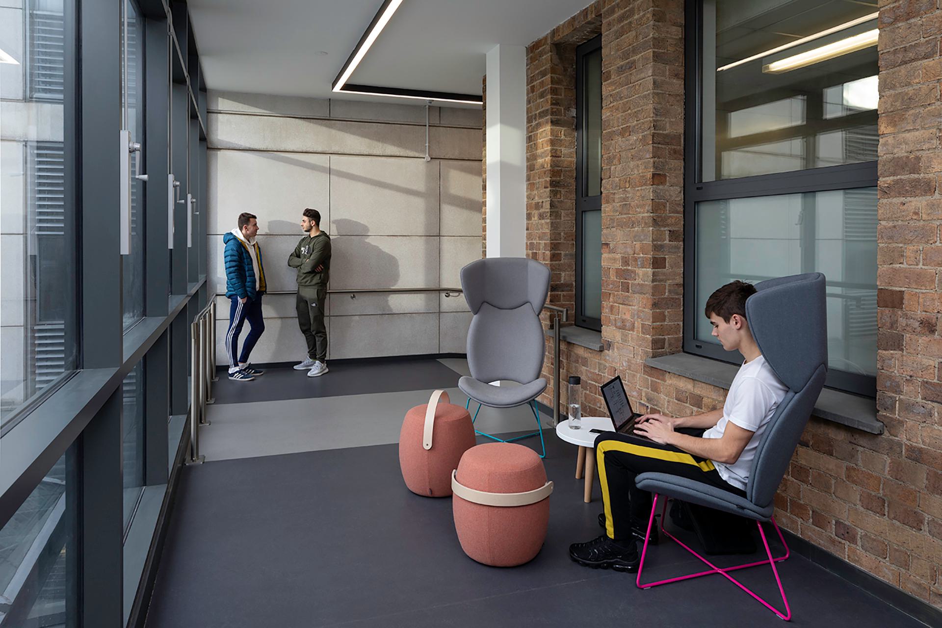
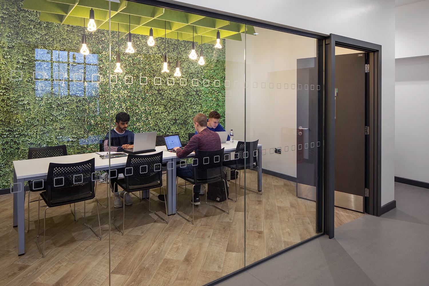
Phase IV completes the refurbishment realising the students’ union ambitions for a dedicated, flexible hub at the heart of University Park. This completes the retail mall and creates a wealth of flexible spaces and rooms that can be reconfigured using a rich palette of furniture styles.
End-users have embraced the building wholeheartedly and students are using every new space generated for study, activities and other social events. The redevelopment has revitalised many of the existing retail units that were scattered around the building/campus and are now all in one central location on the retail floor.
The Students’ Union are now able to have their full ‘Welcome Week Fair’ in the building, companies are very keen to be involved and take the opportunity to introduce their company to the students.
The best and most defining comment received from the Students’ Union has definitely been ‘…the building is unrecognisable from before, I cannot even remember what it looked like!’
